Sunday, 23 February 2014

Locating - Evaluation

Locating - Evaluation

Overall, I have quite enjoyed my personal and live brief during the locating brief. I really liked the subject matter that I focused on, and would like to carry this on into another project.
I believe that honestly, I could have done a lot more work. Having focused on the idea of a fashion brief, something that I have never done before, I really struggled with what I had to do. I struggled with that to produce as a sample and what to show for my drawings, as I had only ever stuck to a typical embroidery structure when producing work, trying to do a fashion brief just completely scrambled my brain. As it is something i've never focused on, I had a lot of things that I did not even know you had to take notice of, such as cost of materials, time, money, colour, texture, etc, etc. However, I have tried this as a brief and it is something that I will not be returning to. I am glad that I have done it, as I now know that I want to be more art-based and that fashion/creating a fashion garment does not interest me at all. 
I do believe that some of the blame is on me. During the time that this brief has been running, I have been struggling with a lot of problems and stresses at home, which has been quite hard to juggle work, university and home life. Unfortunately, I have let these stresses take over and just spent my time trying to sort things out and worrying. I have not connected with my uni work as much as I usually do. I should have been using my work as an escape or to take my mind of things but instead I did not and I know exactly where I have gone wrong and I know that I should have produced a lot more work. I know exactly where I wanted to go with this project right from the start but however, things did not turn out how I wanted them to be.  

Locating - Personal/Live Brief

Locating - Personal & Live Brief - Assessment 

 These are the boards that I am going to present for my assessment of my live brief and my personal brief. I think this shows the two as one project, which is what I wanted all along. I think it shows a range of my research, drawings and samples


Locating - Live Brief

Locating - Live Brief - Designs


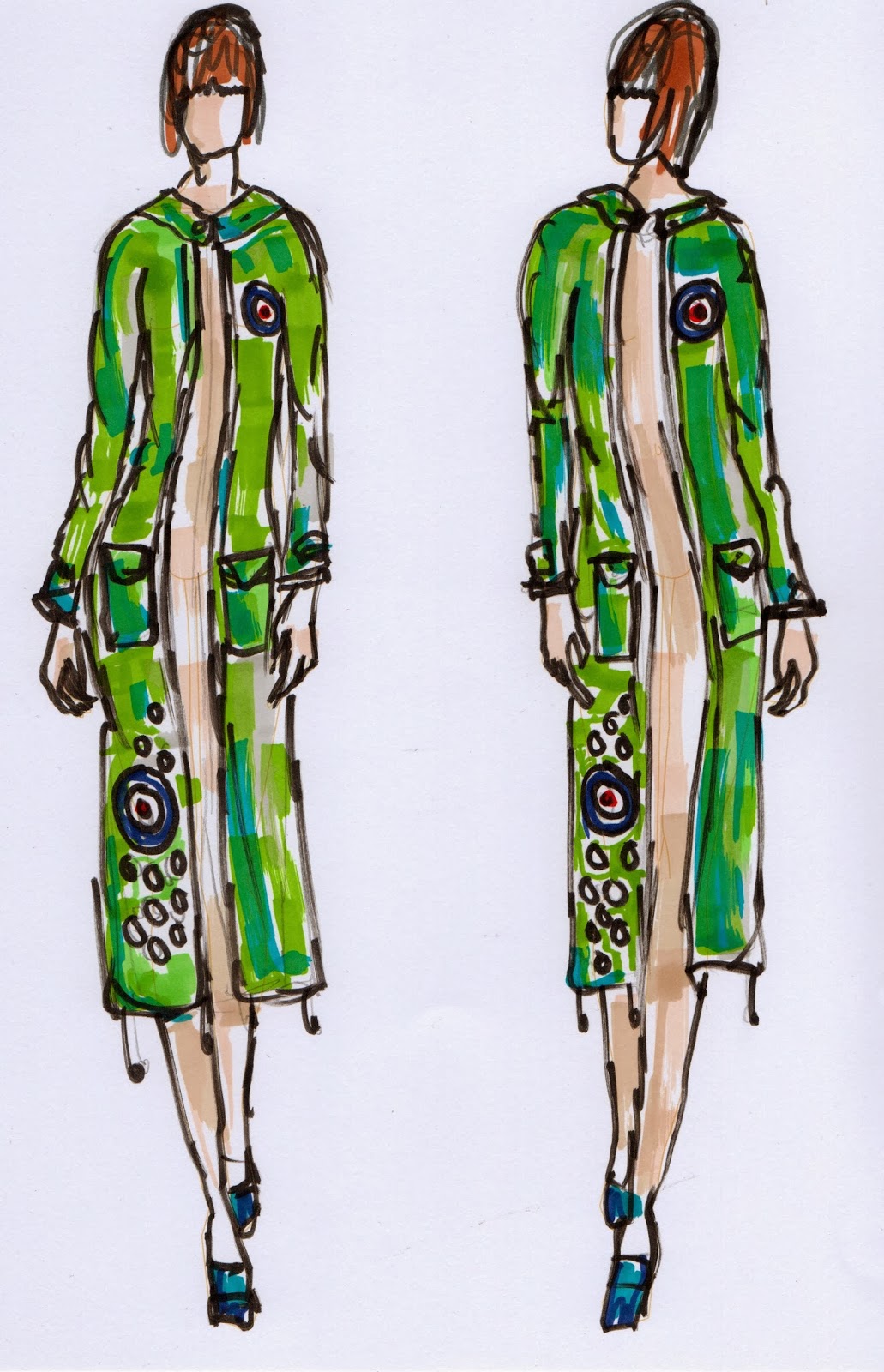
For my live brief, as discussed with Lynn, I decided to connect my two briefs together, mainly focusing on the nineteen-sixties as inspiration. I really wanted to do the 'Pretty Green meets The Who' live brief, which was designing t-shirts for the clothing label, run by Liam Gallagher, Pretty Green. Unfortunately, I thought that I could not finish this brief as it only lasted a couple of days and I didn't think that I would have time. Instead, after speaking to Lynn, she said that I could carry on doing this brief, and connect it to my live brief. This is something that really interested me. I was told that I can alter the brief in order to fit me, still keeping the outlines the same. I decided to continue what it asked for, but using a women's clothing line instead (as Pretty Green do not have a women's line) I thought that it would be an interesting idea to do. 
These are some designs that I drew up, focusing on 1960's fashion, but using a modern-twist, also including my personal brief idea, the badges. 


Locating - Personal Brief

Locating - Personal Brief - Sample Research 


After deciding on what colour palette to use, I then moved on to conducting some research about the different types of badges, both from the the 1960's and the modern day. I decided to stick to the modern day as my main focus of my badge research, as for my live brief, I was focusing on a brief to design clothes for the mens fashion line 'Pretty Green'. I looked into their parka badges, especially focusing on the parka (above) which Liam wore during a live gig. 
I then looked into other modern day fashion houses that created these sort of badges. I began to look into Fred Perry and their 'Twisted Wheel' collection, which featured clothes and accessories which were heavily-covered in embroided badges. Again, this collection of clothing is very influenced by the 1960's club era, which focused around the Manchester bar 'Twisted Wheel' This is where the 'Mod' subculture is said to have been born. From this research, I know that traditionally, the badges are round and kept relatively small, this is something to take away for my own badges. They also feature quite bright colours, to draw attention to them. This is good, as my colour scheme fits perfectly into the design of the badges. 


Friday, 21 February 2014

Locating - Personal Brief

Locating - Personal Brief - Tutorial 

After showing Lynn my badges she gave me lots of ideas on what to do and I came away feeling very inspired. She told me to try and experiment with scale, zooming in on some images, negative space and the different weights of fabrics that I use. I felt that this was very good advice and I aim to create one or two different samples for each suggestion, to show experimentation.

I also discussed my live brief with Lynn, where she suggested that I can link my current work into my live brief. I have decided to use the Pretty Green live brief, but put my own twist on it. I was unsure about it as the brief has now closed, however Lynn said that I could still do it. I have decided to use my badges, just like the live brief asked, but incorporate it onto women's clothes (as Pretty Green does not have a women's clothing line) I felt relieved by this as I was starting to panic about my live brief.

She also mentioned about thinking about the different ways that a fashion buyer would view my badges. In terms of cost, time and materials, how would this been seen, as expensive or as cheap? How could I save time creating these badges. This is something that I have never thought about before, and to be honest, never even thought would be considered when putting together a garment. As I have never really turned my attention to fashion before, this is something completely new to me. 

Locating - Personal Brief

Locating - Personal Brief - Samples


These are some samples that I created just on plain white cotton.
I decided to make the quite small, as thats what the badges are traditionally like. I used the template of a mug as this was just about the perfect size. These are some samples that just focus on the Union Jack and target symbol. I decided to try and exhaust all the different colour options of theses symbols, by changing the colours on each one, the mix of embroidery and layers of fabric. I really like how these have turned out. 

Locating - Personal Brief

Locating - Personal Brief - Samples


When deciding on what colours to use for my samples. I chose to stick to a very strict colour palette, as for my last briefs I never really had one and I started to get a bit confused. I took inspiration from this Yves Saint Laurent dress, which was an icon of the 1960's. I really liked the simple colours, red, blue, yellow, black and white. When researching about the 1960's, this dress was always first to appear whether in books or on the internet. 
I then moved on to deciding what to include in my badges. I took inspiration from different sources, past and present. From the old school parkas of the 1960's to the modern parkas from Fred Perry and Pretty Green. I settled on using the Union Jack flag, and the 'mod' target symbol as these seemed to be quite popular, back in the 60's and in the modern day.